Client
Date
2024
Industry
Coffee Shop
Case Study
Penny's Coffee & Wine Bar
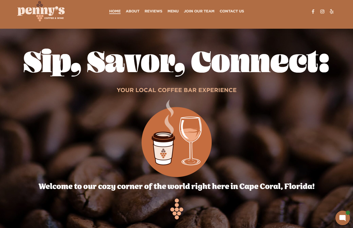
Divine Design & Marketing had the opportunity to meet with the new owners of Penny’s Coffee Bar to help revamp their digital identity. Using our website design and graphic design services, we were able to come up with a new look and feel for the company that not only represented coffee, but also community.
The Challenge
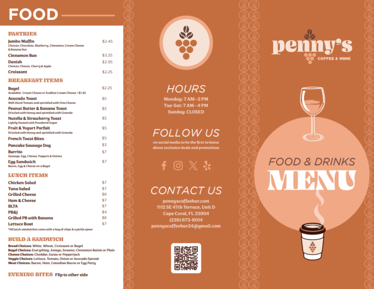
The new owners of Penny’s Coffee Bar had reached out to Divine Design & Marketing to help them assist in creating a visually appealing new look for the company. The old one was outdated and they felt that it didn’t represent the “local community” style and tone. The coloring of the logo wasn’t representative of coffee and simply needed to be revised. Along with the logo creation, this would then need to be applied to their existing coffee packaging. Our team took initiative to make the necessary changes without wasting any time.
Planning
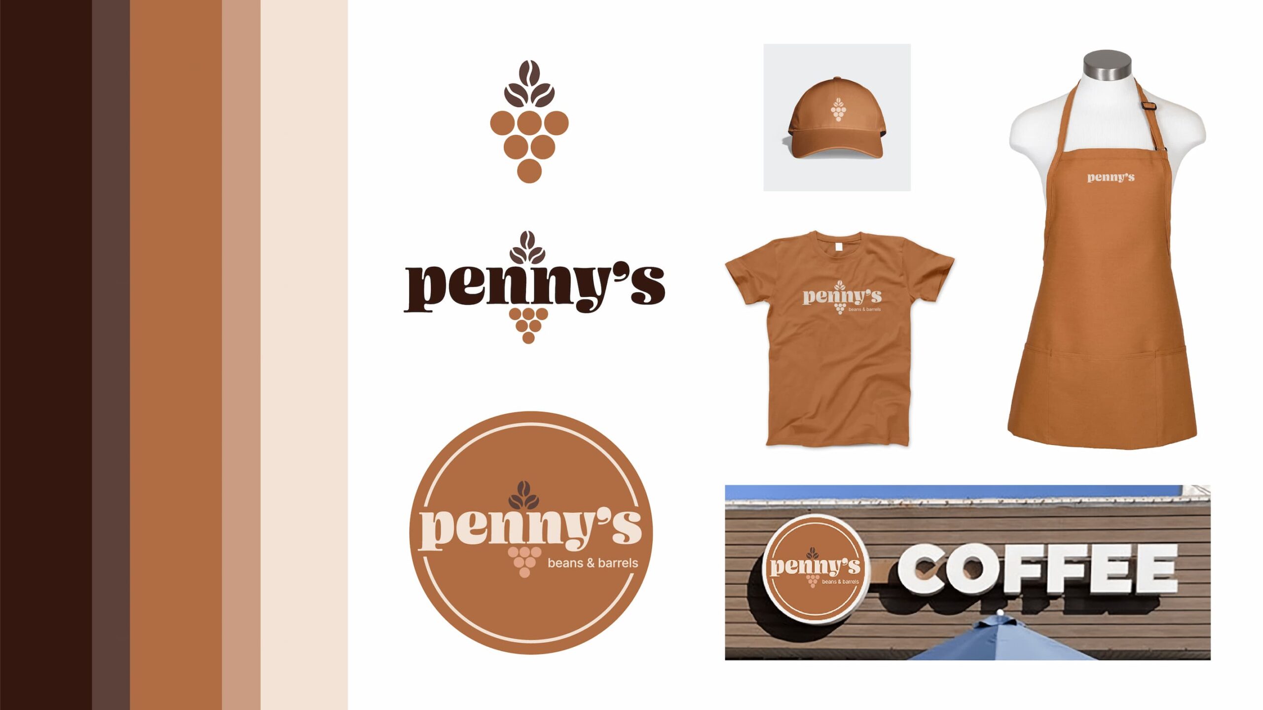
Color Palette and Fonts
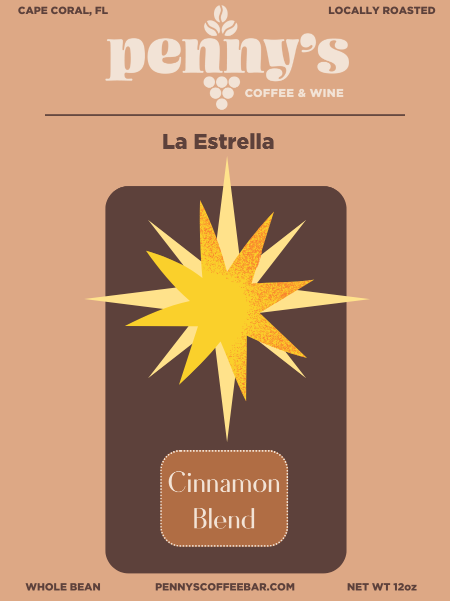
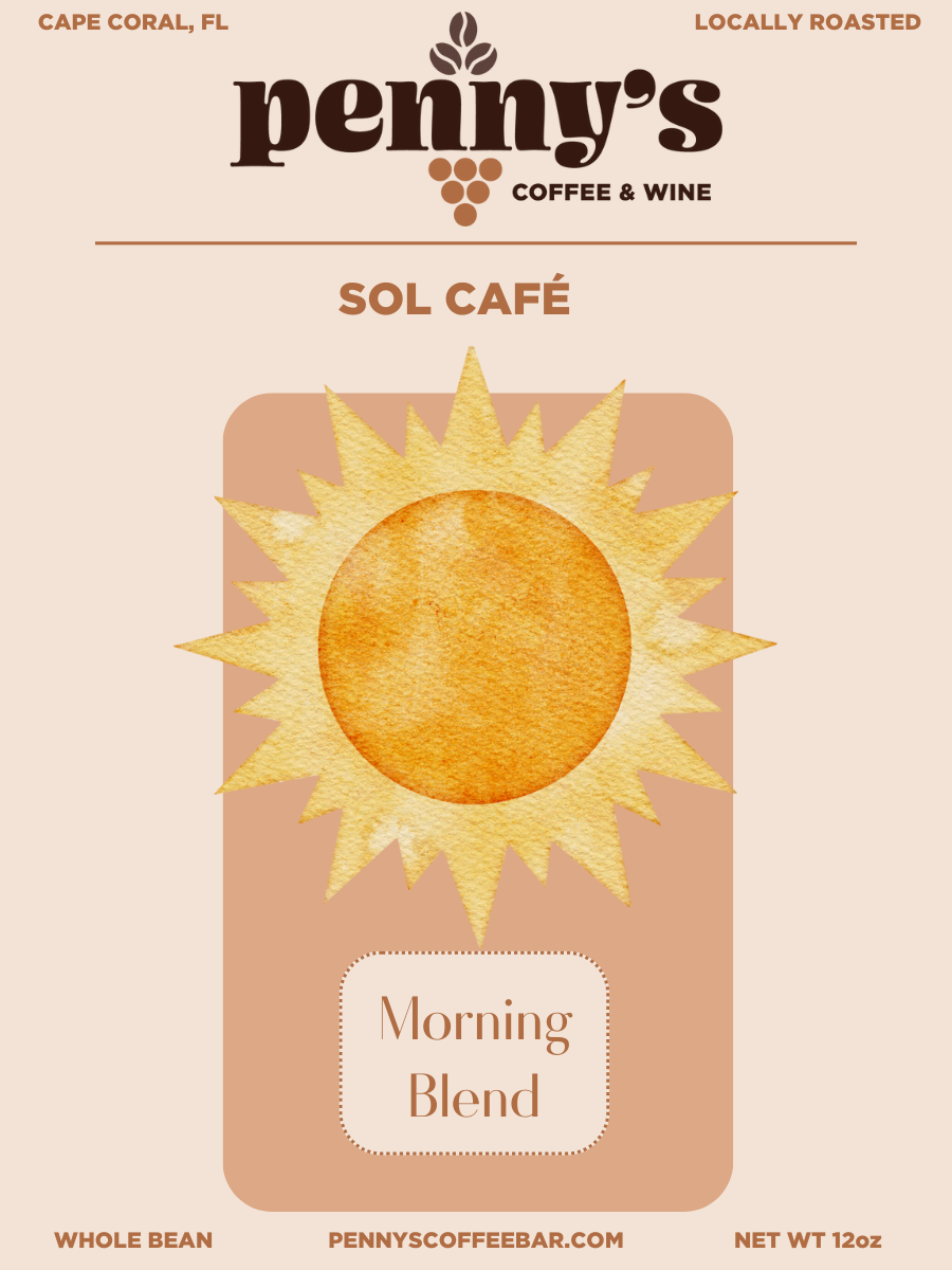
Our main consideration for Penny’s Coffee & Wine Bar was to understand the overall tone of the shop. Knowing that it’s a coffee shop located in Cape Coral, FL, we came up with an idea to involve some of the packaging to incorporate a sun with bright colors that represent the Sunshine state. Tying this in with the colors of coffee, we blended the two together to use a combination of browns that lead to a offsets of a yellow color. Putting this together, we were then left to come to a decision of fonts and typography. Our team chose Sirenia and Ohno Blazeface for a few important reasons. The main reason for Ohno Blazeface was for the costal representation it inherits. The block-like structure mocks a costal wave that fits perfectly with the idea that we were coming up with. Considering this shop is located along the coast in Florida, we knew this would be a perfect choice. Sirenia helps to provide a more decadent yet cozy font, alluding to the exact style of the shop.
Tacao
#EEA983
Cape Palliser
#B06D44
Millbrook
#663F38
Logo Design & Creation
When it came to making a decision as to what the overall logo would be, it was important to present the owners all the options that were available. We initially considered a simpler approach to keep the consistency of minimalism within our logos, but in the end the final outcome was the Penny’s logo including a symbol of grapes that represents the wine aspect of the shop.
Merch Idea with Final Logo Design
Solution